ShopDreamUp AI ArtDreamUp
Deviation Actions


Comments5
Join the community to add your comment. Already a deviant? Log In
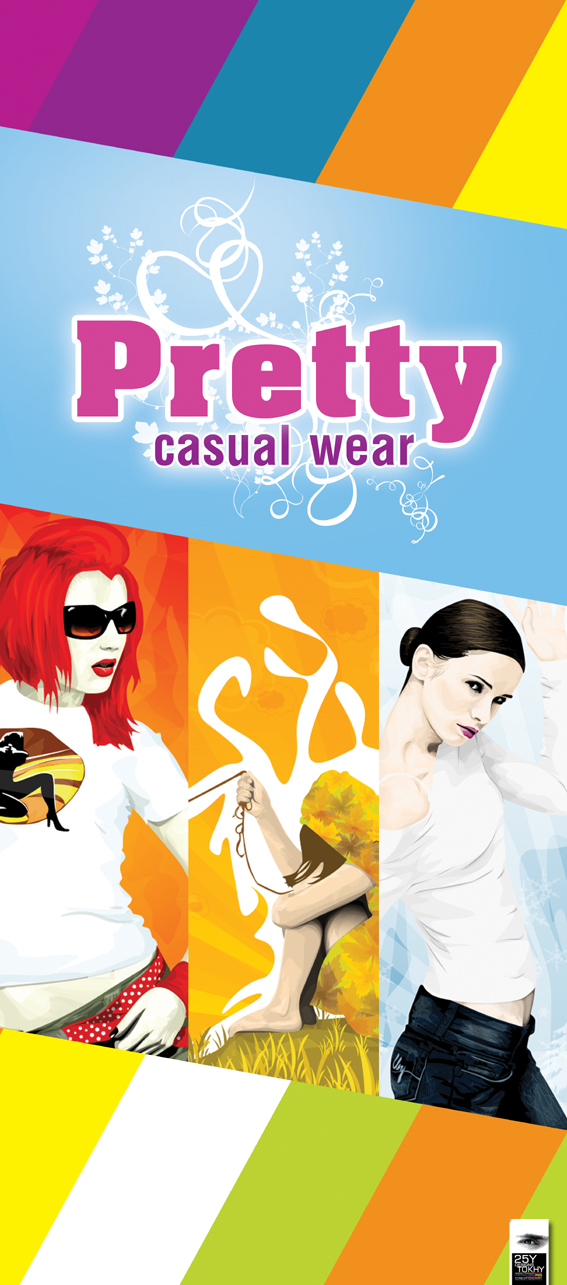
i love the colours in the bottom part of the design..though m not much sure abt the top part..i mean, they're duller as compared to the bottom ones..which pretty much drives our attention downwards..and the duller colour for the text..m not sure..but i think it would look much better if everything on the top was as crisp n contrasted as the bottom part..plus, the right-most image.i dont think it suites the vivid and vibrant environment around it..
those wese just the personal thoughts (Smile)") ..
..
good job..
those wese just the personal thoughts
good job..